

Customize the navbar & carousel, then add some new components
Below is an example of customizing the navbar and carousel in bootstrap, and adding some new components:
Creating a full-fledged admin dashboard is a more complex task, but I can provide you with a basic example to get you started. Keep in mind that a real admin dashboard usually involves backend code to manage data and handle user interactions. In this example, we'll focus on the frontend using Bootstrap.
Below is a simple example of an admin dashboard using Bootstrap:
html
<!doctype html>
<html lang="en">
<head>
<meta charset="utf-8">
<meta name="viewport" content="width=device-width, initial-scale=1.0">
<link rel="stylesheet" href="https://stackpath.bootstrapcdn.com/bootstrap/4.3.1/css/bootstrap.min.css">
<title>customized bootstrap components</title>
</head>
<body>
<!-- navbar -->
<nav class="navbar navbar-expand-lg navbar-dark bg-dark">
<a class="navbar-brand" href="#">my website</a>
<button class="navbar-toggler" type="button" data-toggle="collapse" data-target="#navbarnav" aria-controls="navbarnav" aria-expanded="false" aria-label="toggle navigation">
<span class="navbar-toggler-icon"></span>
</button>
<div class="collapse navbar-collapse" id="navbarnav">
<ul class="navbar-nav ml-auto">
<li class="nav-item active">
<a class="nav-link" href="#">home</a>
</li>
<li class="nav-item">
<a class="nav-link" href="#">about</a>
</li>
<li class="nav-item">
<a class="nav-link" href="#">services</a>
</li>
<li class="nav-item">
<a class="nav-link" href="#">portfolio</a>
</li>
<li class="nav-item">
<a class="nav-link" href="#">contact</a>
</li>
</ul>
</div>
</nav>
<!-- carousel -->
<div id="mycarousel" class="carousel slide" data-ride="carousel">
<!-- indicators -->
<ol class="carousel-indicators">
<li data-target="#mycarousel" data-slide-to="0" class="active"></li>
<li data-target="#mycarousel" data-slide-to="1"></li>
<li data-target="#mycarousel" data-slide-to="2"></li>
</ol>
</div>
<!-- slides -->
<div class="carousel-inner">
<div class="carousel-item active">
<img class="d-block w-100" src="slide1.jpg" alt="slide 1">
<div class="carousel-caption">
<h3>slide 1</h3>
<p>some description for slide 1</p>
</div>
</div>
<div class="carousel-item">
<img class="d-block w-100" src="slide2.jpg" alt="slide 2">
<div class="carousel-caption">
<h3>slide 2</h3>
<p>some description for slide 2</p>
</div>
</div>
<div class="carousel-item">
<img class="d-block w-100" src="slide3.jpg" alt="slide 3">
<div class="carousel-caption">
<h3>slide 3</h3>
<p>some description for slide 3</p>
</div>
</div>
</div>
<!-- controls -->
<a class="carousel-control-prev" href="#mycarousel" role="button" data-slide="prev">
<span class="carousel-control-prev-icon" aria-hidden="true"></span>
<span class="sr-only">previous</span>
</a>
<a class="carousel-control-next" href="#mycarousel" role="button" data-slide="next">
<span class="carousel-control-next-icon" aria-hidden="true"></span>
<span class="sr-only">next</span>
</a>
</div>
<!-- new components -->
<div class="container mt-5">
<div class="row">
<div class="col-md-6">
<div class="card">
<img src="card1.jpg" class="card-img-top" alt="card 1">
<div class="card-body">
<h5 class="card-title">card 1</h5>
<p class="card-text">some text describing card 1.</p>
<a href="#" class="btn btn-primary">read more</a>
</div>
</div>
</div>
<div class="col-md-6">
<div class="card">
<img src="card2.jpg" class="card-img-top" alt="card 2">
<div class="card-body">
<h5 class="card-title">card 2</h5>
<p class="card-text">some text describing card 2.</p>
<a href="#" class="btn btn-primary">read more</a>
</div>
</div>
</div>
</div>
</div>
<script src="https://code.jquery.com/jquery-3.3.1.slim.min.js"></script>
<script src="https://cdnjs.cloudflare.com/ajax/libs/popper.js/1.14.7/umd/popper.min.js"></script>
<script src="https://stackpath.bootstrapcdn.com/bootstrap/4.3.1/js/bootstrap.min.js"></script>
</body>
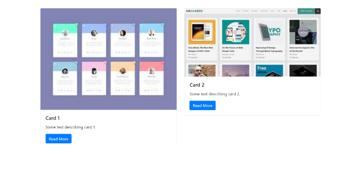
</html>in this example, we have customized the navbar and carousel, and added two new components: cards.
The navbar has a dark background using the `bg-dark` class, and the brand name is set to "my website". the navbar items are organized within the `navbar-nav` list, and each item has a corresponding link.
The carousel contains three slides with images and captions. each slide is wrapped inside a `carousel-item` div, and the active slide is specified using the `active` class. the slide images are set using the `d-block` and `w-100` classes for responsive behavior. the captions are added within the `carousel-caption` div.
Two new components, cards, are added below the carousel. each card has an image, title, description, and a "read more" button. the cards are organized within a `container` and a `row`, and their responsiveness is controlled using the `col-md-6` class.
You can replace the placeholder text, images, and customize the styles as needed. make sure to update the image sources (`src`) for the carousel slides and cards.
Remember to include the required bootstrap css and javascript dependencies to ensure the components work properly.
Output:

About the Author

Silan Software is one of the India's leading provider of offline & online training for Java, Python, AI (Machine Learning, Deep Learning), Data Science, Software Development & many more emerging Technologies.
We provide Academic Training || Industrial Training || Corporate Training || Internship || Java || Python || AI using Python || Data Science etc


PreviousNext
Join our newsletter for the latest updates.
About us
Our Services
Contact Us
Our Courses
Learn Python | Learn AI | Learn Machine Learning | Learn Deep Learning | Learn Core Java | Learn Java JSP | Learn Java Servlet | Learn Java Spring Core | Learn Spring Boot | Learn Power BI | Learn DAA | Learn HTML | Learn SQL | Learn C Programming | Learn Bootstrap | Learn Git | Learn JavaScript | Learn Data Structure Using C | Learn RDBMS | Learn Data Science | Learn PHP
Our Tutorials
Python Tutorial | AI Tutorial | Machine Learning Tutorial | Deep Learning Tutorial | Core Java Tutorial | Java JSP Tutorial | Java Servlet Tutorial | Java Spring Tutorial | Spring Boot Tutorial | Power BI Tutorial | DAA Tutorial | HTML Tutorial | SQL Tutorial | C Programming Tutorial | Bootstrap Tutorial | Git Tutorial | JavaScript Tutorial | Data Structure Using C Tutorial | RDBMS Tutorial | Data Science Tutorial | PHP Tutorial
Copyright © 2023 Pythontpoint Powered by Silan Software Pvt. Ltd. All rights reserved.