

Navbar Collapse
Here's an example of a responsive navbar with a collapsing feature using Bootstrap:
html
<!DOCTYPE html>
<html>
<head>
<title>Responsive Navbar</title>
<link rel="stylesheet" href="https://maxcdn.bootstrapcdn.com/bootstrap/4.3.1/css/bootstrap.min.css">
</head>
<body>
<nav class="navbar navbar-expand-lg navbar-light bg-light">
<a class="navbar-brand" href="#">Logo</a>
<button class="navbar-toggler" type="button" data-toggle="collapse" data-target="#navbarCollapse" aria-controls="navbarCollapse" aria-expanded="false" aria-label="Toggle navigation">
<span class="navbar-toggler-icon"></span>
</button>
<div class="collapse navbar-collapse" id="navbarCollapse">
<ul class="navbar-nav mr-auto">
<li class="nav-item active">
<a class="nav-link" href="#">Home</a>
</li>
<li class="nav-item">
<a class="nav-link" href="#">About</a>
</li>
<li class="nav-item">
<a class="nav-link" href="#">Services</a>
</li>
<li class="nav-item">
<a class="nav-link" href="#">Contact</a>
</li>
</ul>
</div>
</nav>
<script src="https://ajax.googleapis.com/ajax/libs/jquery/3.4.1/jquery.min.js"></script>
<script src="https://cdnjs.cloudflare.com/ajax/libs/popper.js/1.14.7/umd/popper.min.js"></script>
<script src="https://maxcdn.bootstrapcdn.com/bootstrap/4.3.1/js/bootstrap.min.js"></script>
</body>
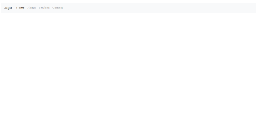
</html>In the above example, Bootstrap classes and components are used to create a responsive navbar. The navbar collapses into a hamburger menu on smaller screens, and expands into a full menu on larger screens.
The `navbar` class creates the basic structure of the navbar. The `navbar-brand` class is used for the logo or brand name. The `navbar-toggler` class represents the hamburger menu button. The `collapse` class is used to specify the element that should collapse or expand. The `navbar-nav` class is used to define the unordered list of navbar items.
You can add more navbar items by appending additional `<li>` elements within the `<ul class="navbar-nav mr-auto">` section. Each `<li>` element should have the `nav-item` class, and the anchor tag (`<a>`) inside it should have the `nav-link` class.
Remember to include the Bootstrap CSS and JavaScript files using the provided CDN links in the `<head>` section of your HTML document.
To customize the navbar further, such as changing the logo, adding dropdown menus, or modifying the layout to fit your website's design.
Output:
About the Author

Silan Software is one of the India's leading provider of offline & online training for Java, Python, AI (Machine Learning, Deep Learning), Data Science, Software Development & many more emerging Technologies.
We provide Academic Training || Industrial Training || Corporate Training || Internship || Java || Python || AI using Python || Data Science etc


PreviousNext
Join our newsletter for the latest updates.
About us
Our Services
Contact Us
Our Courses
Learn Python | Learn AI | Learn Machine Learning | Learn Deep Learning | Learn Core Java | Learn Java JSP | Learn Java Servlet | Learn Java Spring Core | Learn Spring Boot | Learn Power BI | Learn DAA | Learn HTML | Learn SQL | Learn C Programming | Learn Bootstrap | Learn Git | Learn JavaScript | Learn Data Structure Using C | Learn RDBMS | Learn Data Science | Learn PHP
Our Tutorials
Python Tutorial | AI Tutorial | Machine Learning Tutorial | Deep Learning Tutorial | Core Java Tutorial | Java JSP Tutorial | Java Servlet Tutorial | Java Spring Tutorial | Spring Boot Tutorial | Power BI Tutorial | DAA Tutorial | HTML Tutorial | SQL Tutorial | C Programming Tutorial | Bootstrap Tutorial | Git Tutorial | JavaScript Tutorial | Data Structure Using C Tutorial | RDBMS Tutorial | Data Science Tutorial | PHP Tutorial
Copyright © 2023 Pythontpoint Powered by Silan Software Pvt. Ltd. All rights reserved.