

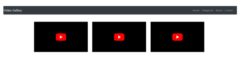
Responsive Video Gallery in Bootstrap
Here's an example of a responsive video gallery using Bootstrap:
<!DOCTYPE html>
<html>
<head>
    <title>Responsive Video Gallery</title>

    <link rel="stylesheet" href="https://maxcdn.bootstrapcdn.com/bootstrap/4.5.2/css/bootstrap.min.css">
    <style>
        .video-container {
            position: relative;
            padding-bottom: 56.25%;
            height: 0;
            overflow: hidden;
        }

        .video-container iframe,
        .video-container embed,
        .video-container object,
        .video-container video {
            position: absolute;
            top: 0;
            left: 0;
            width: 100%;
            height: 100%;
        }

    </style>
</head>
<body>

    <!-- Navbar -->
    <nav class="navbar navbar-expand-lg navbar-dark bg-dark">
        <a class="navbar-brand" href="#">Video Gallery</a>
        <button class="navbar-toggler" type="button" data-toggle="collapse" data-target="#navbarNav" aria-controls="navbarNav" aria-expanded="false" aria-label="Toggle navigation">
            <span class="navbar-toggler-icon"></span>
        </button>
        <div class="collapse navbar-collapse" id="navbarNav">
            <ul class="navbar-nav ml-auto">
                <li class="nav-item">
                    <a class="nav-link" href="#">Home</a>
                </li>
                <li class="nav-item">
                    <a class="nav-link" href="#">Categories</a>
                </li>
                <li class="nav-item">
                    <a class="nav-link" href="#">About</a>
                </li>
                <li class="nav-item">
                    <a class="nav-link" href="#">Contact</a>
                </li>
            </ul>
        </div>
    </nav>

    <!-- Video Gallery -->
    <div class="container mt-5">
        <div class="row">
            <div class="col-md-4">
                <div class="video-container">
                    <iframe src="https://www.youtube.com/embed/VIDEO_ID_1" frameborder="0" allowfullscreen></iframe>
                </div>
            </div>
            <div class="col-md-4">
                <div class="video-container">
                    <iframe src="https://www.youtube.com/embed/VIDEO_ID_2" frameborder="0" allowfullscreen></iframe>
                </div>
            </div>
            <div class="col-md-4">
                <div class="video-container">
                    <iframe src="https://www.youtube.com/embed/VIDEO_ID_3" frameborder="0" allowfullscreen></iframe>
                </div>
            </div>
        </div>
    </div>

    <script src="https://cdnjs.cloudflare.com/ajax/libs/jquery/3.5.1/jquery.min.js"></scr
    ipt>
    <script src="https://cdnjs.cloudflare.com/ajax/libs/popper.js/1.16.0/umd/popper.min.js"></script>
    <script src="https://maxcdn.bootstrapcdn.com/bootstrap/4.5.2/js/bootstrap.min.js"></script>

</body>
</html>
In this example, we have a responsive video gallery layout using Bootstrap's grid system. Each video is wrapped in a `video-container` div with a fixed aspect ratio achieved using padding. The videos are embedded using iframes with YouTube video URLs. You can replace the `VIDEO_ID_1`, `VIDEO_ID_2`, and `VIDEO_ID_3` placeholders with the actual YouTube video IDs. The video gallery will automatically adjust its layout based on the screen size, thanks to Bootstrap's responsive grid classes.
Output:
About the Author

Silan Software is one of the India's leading provider of offline & online training for Java, Python, AI (Machine Learning, Deep Learning), Data Science, Software Development & many more emerging Technologies.
We provide Academic Training || Industrial Training || Corporate Training || Internship || Java || Python || AI using Python || Data Science etc


Previous
Join our newsletter for the latest updates.
About us
Our Services
Contact Us
Our Courses
Learn Python | Learn AI | Learn Machine Learning | Learn Deep Learning | Learn Core Java | Learn Java JSP | Learn Java Servlet | Learn Java Spring Core | Learn Spring Boot | Learn Power BI | Learn DAA | Learn HTML | Learn SQL | Learn C Programming | Learn Bootstrap | Learn Git | Learn JavaScript | Learn Data Structure Using C | Learn RDBMS | Learn Data Science | Learn PHP
Our Tutorials
Python Tutorial | AI Tutorial | Machine Learning Tutorial | Deep Learning Tutorial | Core Java Tutorial | Java JSP Tutorial | Java Servlet Tutorial | Java Spring Tutorial | Spring Boot Tutorial | Power BI Tutorial | DAA Tutorial | HTML Tutorial | SQL Tutorial | C Programming Tutorial | Bootstrap Tutorial | Git Tutorial | JavaScript Tutorial | Data Structure Using C Tutorial | RDBMS Tutorial | Data Science Tutorial | PHP Tutorial
Copyright © 2023 Pythontpoint Powered by Silan Software Pvt. Ltd. All rights reserved.